Brand development and a how-to manual design for Cooperation Town
Cooperation Town co-ops are small neighbourhood buying groups, providing their members with free and affordable groceries, sourced in bulk and distributed at a very low price. They are owned by their members and run according to local needs.


Client
Cooperation Town
Role
Brand development and a how-to manual design for Cooperation Town. The manual was created to be accessible to be read and followed my a large variety of people. The output of this project contributed to the network of food co-ops growing from a couple in London to thirty across the country.


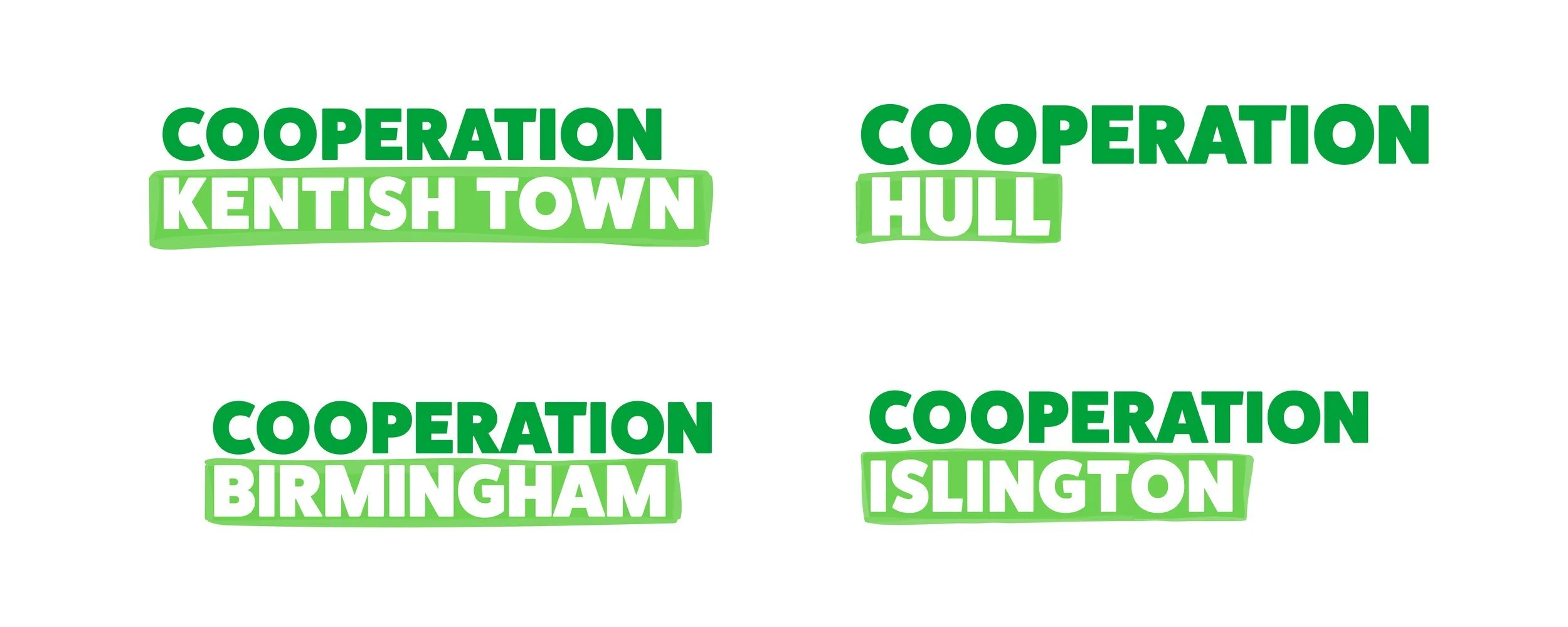
The logo is an identifier of the movement.
The boldness helps the brand be clear and legible across all applications. Each Coop’s name will be added onto the core logo so it is easily identified as part of the same group.
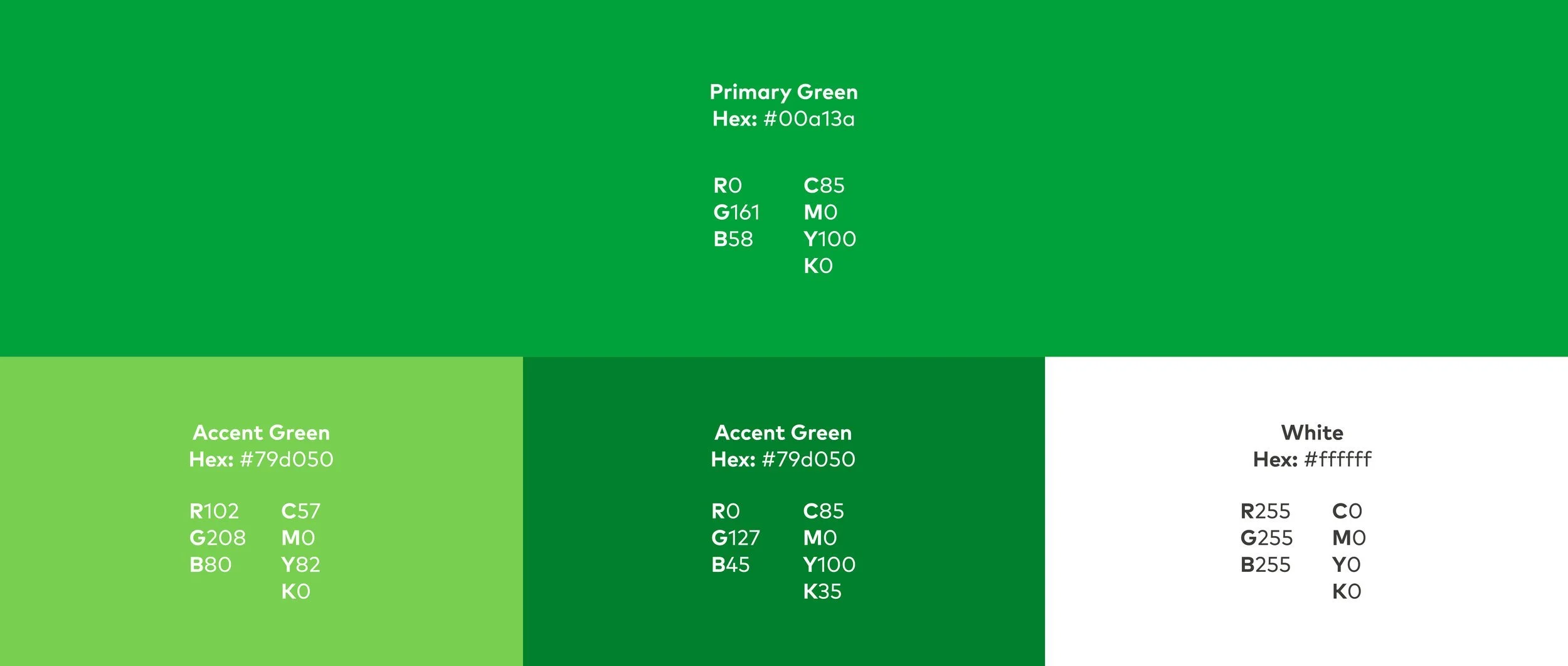
The brand colours are synonymous with sustainability and fresh, healthy food.
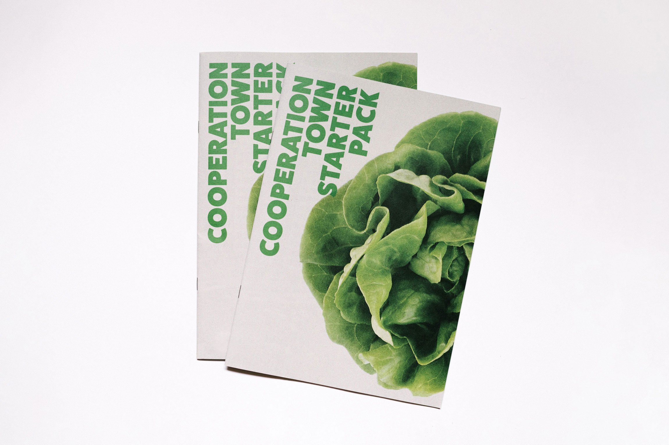

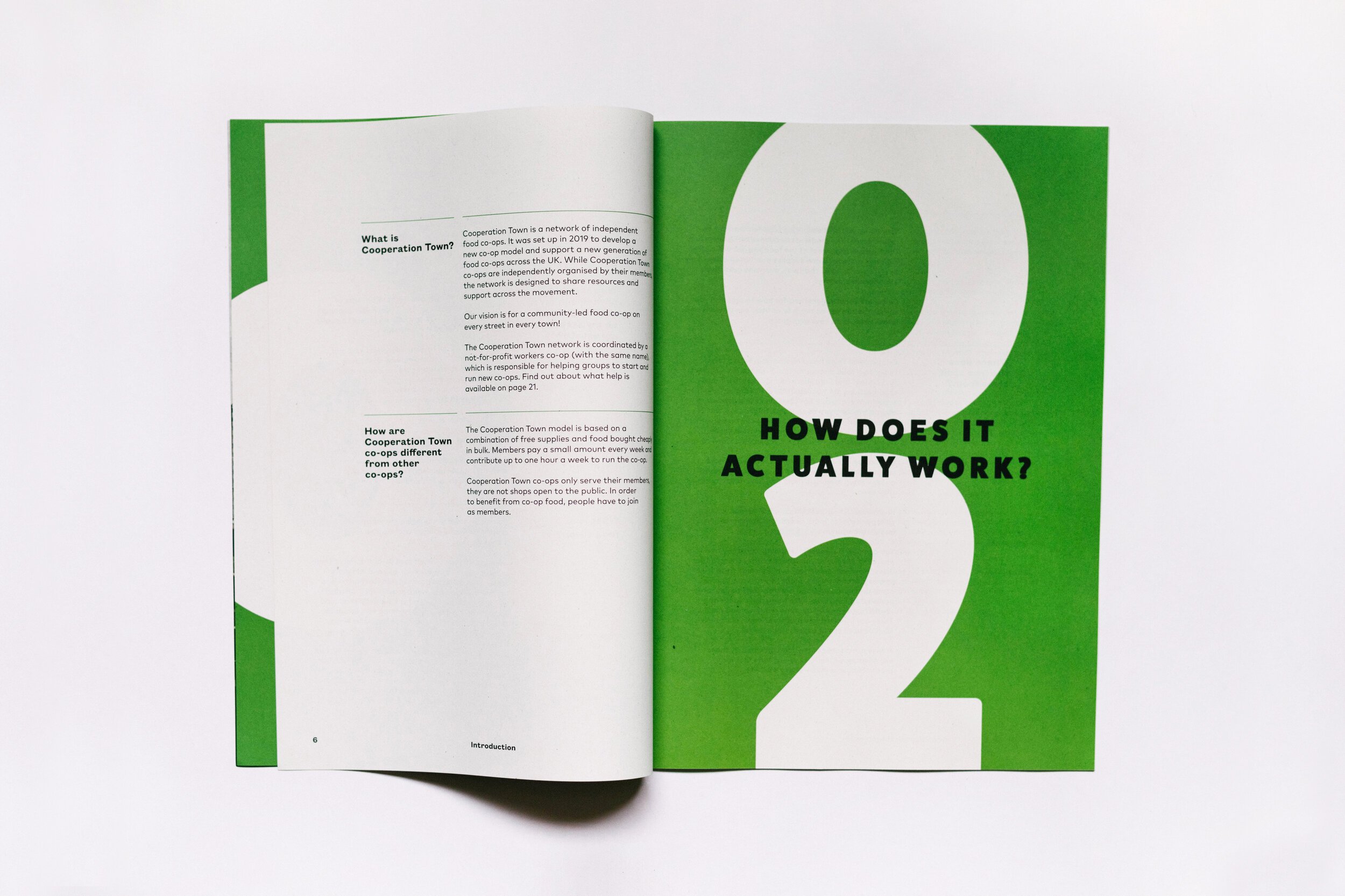
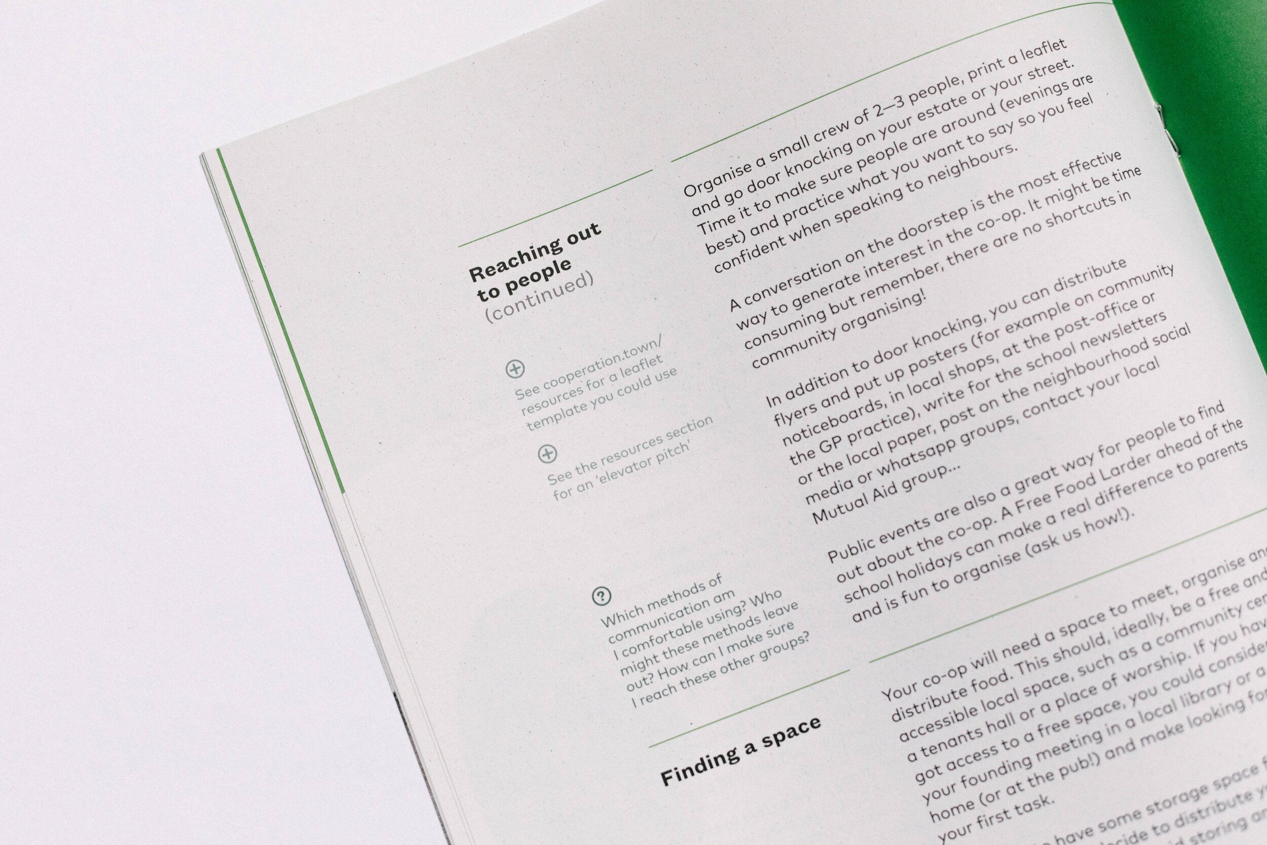
Accessibility, legibility and ease of navigation were the main factors that informed the design of all brand materials.